

Korean film director, Park Chan-wook, outlines Yu Jiwon’s diverse practice in these words: “She is a humanist with a brain of a scientist, hand of a designer and a heart of a poet.” As a design educator, typographer and a writer based in Seoul, Yu Jiwon’s expertise lies in Korean typography, with a broader perspective of graphic design through the lens of math and science. Her publications address matters of typography by bending boundaries within graphic design. The former host of the Korean Society of Typography in 2016, she continuously questions the effect of typography on the marginalized, and challenges the arrogance of globality by suggesting the concept of “interlocality” for multilingual typography. In the following interview, expanding upon this idea, Yu Jiwon discusses the diverse perspectives of marginalized typographies and the power logic within its relations to Latin characters.
Rachel Jung: In your books The Typographic Landscape (글자풍경) and Newton’s Atelier (뉴턴의 아틀리에), you reflect on the formative background of East Asian culture through different methods of interpreting space, highlighting that Hangul is being forced to fit into the spatial logic of Latin characters.
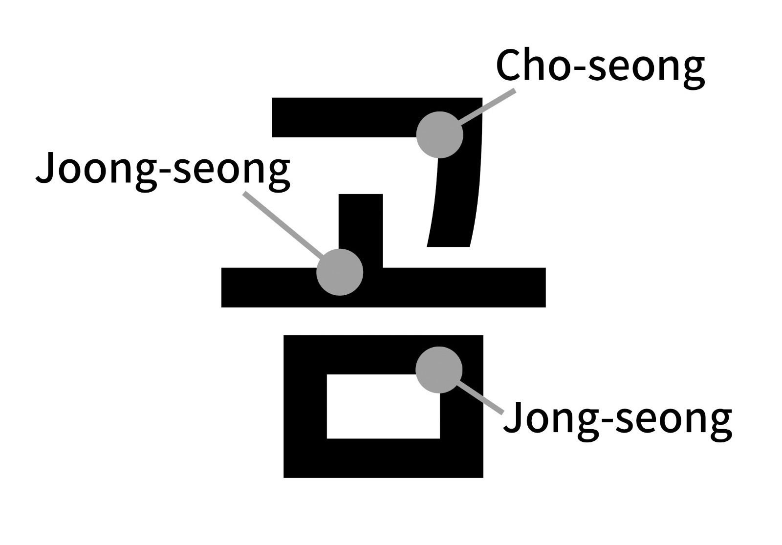
Yu Jiwon: Even if it physically exists, space is not an “object” that is viewed as it is, but rather something that is perceived differently by each culture. For example, even though the questions and answers around the spatial perception of mathematics in the East and West were similar, their methods of problem-solving are different. The West adapted Greek mathematics, a linear method that follows a certain direction upon one dimensional line; whereas the East follows the Cheonwon-Jibang (天圓地方) which translates to “the sky is round and the earth is square,” and sees the ground as divided squares. In essence, these different perspectives of space are applied in all cultures and written languages. For instance, Latin characters draw letters in a two-dimensional way, and the direction of the letters is linear. On the other hand, the East uses a system of combining multiple segments into a section, so we have different elements for one character. Chinese characters have different radicals; and Hangul has phonemes called Cho-seong, Joong-seong and Jong-seong, and they build a square syllable block. These components have to be combined in a module that uses both the x and y axes, and this makes it quite difficult to fit into the Western logic.
Hangul’s own advantages and ways of thinking are perceived as flaws when brought to the Western machines or programs. These systems and devices decipher scripts based on how close or further away from Latin they are read. For example, when asked whether Cyrillic script faced any difficulties due to the Latin dominance over technology, Russian type and graphic designer Ruderman Ilya explained that Cyrillic is the closest to Latin—even closer than the Greek alphabet, so they do not face much hardship, although the interpretation of white space can be quite different.
Is that different from what you mentioned in The Typographic Landscape about the white space within Arabic alphabets or Devanagari, or are they similar?
It’s not as disparate. Arabic characters have their own unique mathematical system, and the way they are used within Indian culture is usually surrounded by a lot of color, which makes them very distinct. For instance, when we think of Cyrillic script and Latin characters, they share the way space is presented. However, they almost seem like a different dialect, as they appear to have different preferences in how they use space. If Hangul and Chinese characters are like completely different species to Latin characters, Cyrillic is more like a mutation of Latin.
Could you also tell us a bit more about the inter-local perspective you mentioned in your book?
If globalism was based on a late 20th century imperialist ideology in which the non-Western world followed the Western influence while excluding their own local identity, then an inter-local perspective acknowledges that the Western method is not the only way to solve problems. The concept of interlocality is not saying “ours is the best,” but rather embracing diversity for all typography. It is not a competition, but a cooperation. Globalism, on the other hand, is about one side being “better” than the other.
I really enjoyed your example of Hong Kong in labels or logos. You mentioned how they keep the Chinese characters and Latin alphabet’s respective grids by using an analogue stencil method to texture it in a harmonious way. Would there be a way for Korea to keep the uniqueness and quality of Hangul when mixing with Latin characters? Or what would you consider a method or texture of Hangul?
First of all, there is a difference in density between Hangul and Latin. Korean designers try to minimize the contrast of the two languages, but that is mostly done by forcing Hangul to fit into the Western logic. If you look at Korean calligraphy done with brushes, they actually emphasize the difference of density. If Latin characters are relatively geometric, East Asian characters are full of physical quantity. There is a variable of speed and density, and I would like to research these physical parameters in the future.
The contrast within Latin characters, for example the change of thickness, is a geometric phenomenon that occurs on a flat surface. When we write characters with a brush, the ink evaporates depending on the brush used. The change occurring within the process of evaporating and applying ink is what is known as density. This density is something that you need to create an equal balance for in Western typography, but traditional Korean calligraphy celebrates the difference. Now with the technology of Open Type Format (OTF) in the digital paradigm, it is possible to create algorithms to generate these complicated systems. This is done by creating a parameter using the density as a variable.
It’s quite hard to imagine these variables digitized, since Western logic assumes an international typeface, and the Western perspective of a “good” typeface is so pervasive. Has this also been your experience?
I think interlocality can be a way of resisting globality. When I hosted the Korean Society of Typography in 2016, we discussed the idea of interlocality with a German designer, an Indian designer, and an American designer who designs typefaces for Japanese Kana. Western designers used to cut me off when I was speaking, saying that I was wrong, but they actually didn’t understand what I was talking about. This came from their belief that I was inferior to them in terms of design knowledge, and their behavior exposed the mindset that scripts have to adjust to the Western logic when it comes to the balance of multilingual typography. This showed just how one-sided globality really is. I don’t think people understand what I am saying now because I gained more authority since back then, but rather because society in general is changing and more people are starting to see the urgency of the issue of interlocality. I am very happy about this change.
In current Korean society where English is almost ubiquitous, how do you think multilingual typography should be taught as part of Korea’s design education?
Until almost five years ago, multilingual typography used to follow the Latin logic by default. There was a time when we did not realize how problematic the term “non-Latin” was, and us Korean designers aren’t familiar with our typographic logic or our own math we use. Even though nowadays there is this consciousness of ignorance within Korean society, the educational system is still very Westernized. It is said that after three generations, a system dies off. Now that we are at the brink of this moment of extinction, I think we need to begin admitting our ignorance of our own culture. It is critical that we all educate ourselves. If globalism was a one-sided phenomenon, we need to follow interlocalism in a multi-sided way.
“We as the marginalized design regions need to confront Western design with more confidence. We need to acknowledge the value of diversity.”
Western designers often used their logic to say that it would be easier for us to learn their language and rules. It is similar to how the male body became a standard and the female body became an “other” because it does not fit the standard. I think this is similar not only in the design industry, but within the wider society itself, as more and more people are vocalizing similar issues. However, when we look at how we see our own language, we realize that we may also be repeating this dominant typographic logic. We often praise Hangul as “the most beautiful language,” and even have a national holiday to celebrate it, but that in itself is arrogant and ignorant. In addition, the way some dominant design regions argue that “you can just adjust to us” diminishes the hardship of the minority, and this makes people believe that “adjusting” to it is an easy way out. But this mindset is something that needs to be challenged. We as the marginalized design regions need to confront Western design with more confidence. We need to acknowledge the value of diversity; in fact, I believe that diversity in written language could heal society through neuroscience and evolutionary logic.
Could you please elaborate?
In both cognitive psychology and evolutionary psychology, it is believed that diversity can help us adapt to changes or survive disasters of all scales. Cognitive science explains that children who experience and play with various objects can develop broader ways of thinking, and that diversity can be a method to solve disasters in terms of human evolution. Evolution tends to happen randomly when it comes to culture. The human body has adapted to its current environment, although there are still a lot of deficient parts in our bodies. However, this deficit enables diversity through difference. Let’s hypothetically think of a sudden disaster or epidemic. If all human bodies reacted the same way, we would become extinct. Difference is the greatest value in our current unstable society. Similarly, our current world will be constantly challenged with new changes in various fields. To adapt to these changes, it is important to think about the possibilities that the diversity of written language can bring as a solution.
Then what would you say the crisis in typography is, and what do we need to be aware of, in order to promote diversity in typography?
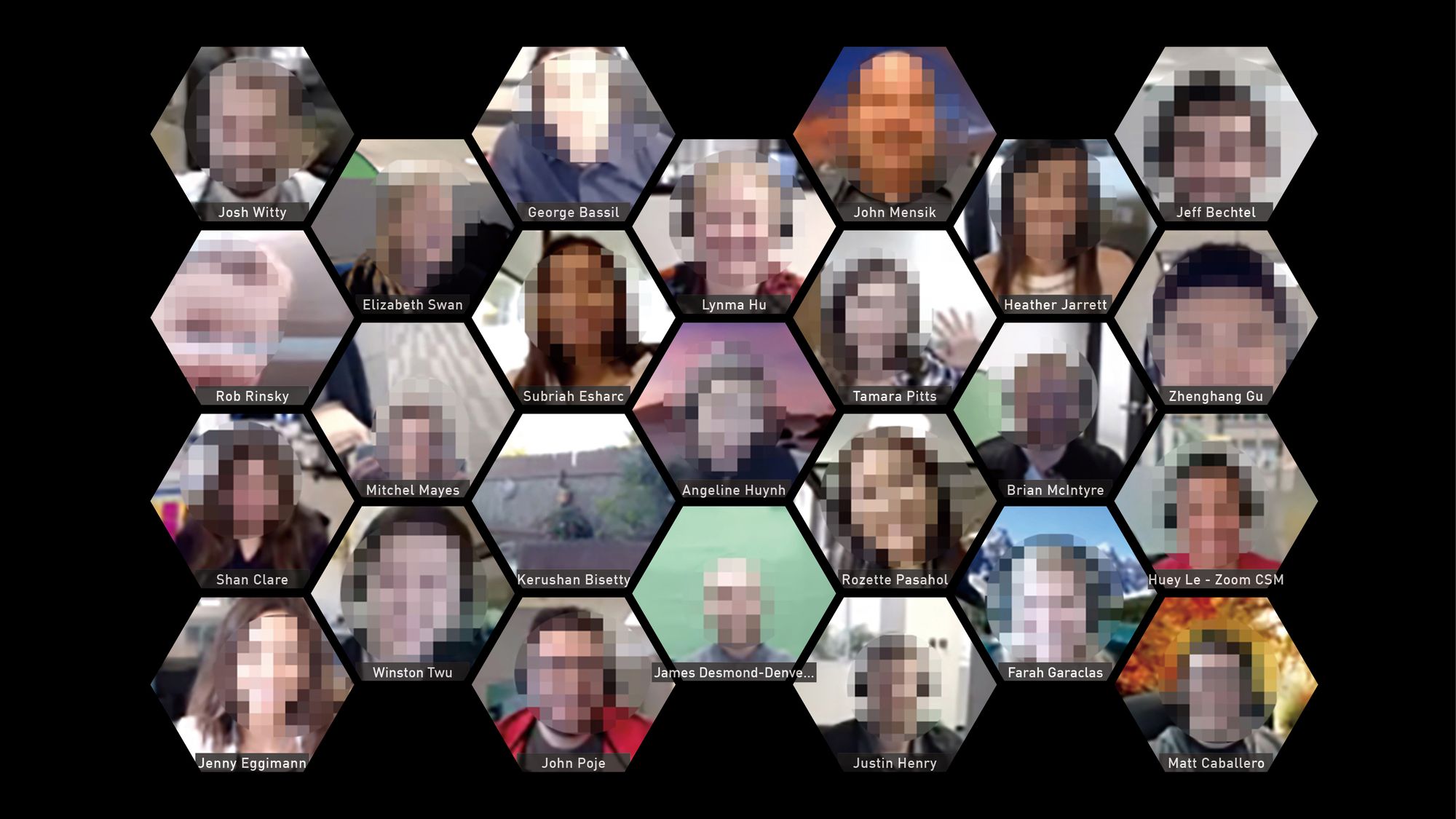
It might not be a crisis to the Latin script itself, but it becomes critical when we consider the wider viewpoint. When Latin script users, creators and advocates exclude other scripts, they will be limited to finding different methods of solving problems. This may cause discomfort for the whole world, since these Latin users are the same people that are in charge of many emerging technologies. For example, much of the communication and conferencing softwares that are rapidly emerging during the Covid-19 pandemic are missing alternative solutions. For example, the rectangular grid used in the typical Western interface should not be the only option. If they adopted the Korean grid, which is hexagon-shaped, it could have helped to develop softwares in another way for physical human cognition. This would effectively use the “left out” space, thus allowing for more users to be viewed on one screen; and also eradicate much of the unnecessary background images of each individual. This may not necessarily be the ultimate solution, but it provides an apt example of how considering diversity in these technological environments can be advantageous.

Hangul adapts easier to the rapid change of technology, compared to the characters of many other regions. Whenever a digital device updates its system, Latin characters are able to find the best font and update quicker, whereas Hangul lags behind. Despite that, Hangul users still manage to keep up with the change in the technology although it can be slower than the Latin letters, whereas many of the world’s other characters are not even available on digital devices—leaving these users to resort to Latin characters as their written script. For regions that use marginalized characters (소수문자), forcing them to use Latin characters endangers not only written scripts, but also the languages themselves.
Asian design history is less researched or archived compared to Western design history. Given this current situation, how do you think Western designers should educate themselves about Asian design history?
For Asian design history, there might be parts that are compiled, but it does lack an overall perspective since the development process is quite different. In Korea’s case, design research was conducted during the Japanese colonial period (1910–1945) and during the post-Park Chung-hee’s dictatorship period (1963–1979), but it is rare to find design research spanning the whole of Korean history. The West has books like A History of Graphic Design by Phillip B. Meggs. It is interesting that—to my knowledge, at least—there is no research about Korean, Chinese, and Japanese design history altogether. Still, there are efforts from certain designer groups, though it might be a bit lacking. Asian designers that chase the kinds of aesthetics produced by the groups are often regarded as the roots of contemporary Asian design, but in my perspective what they do is still very limited—both in terms of localities covered, and in how they bring together designs and designers that fit their taste of similar aesthetics. Although these efforts are positive, I wish that they wouldn’t generalize the representation of all of Asia.
“There is a big chance that Asian designers that are familiarized with Western society are also those who are deeply engaged with Western styles of aesthetics. We must question whether these few designers can genuinely represent ‘Asian’ design.”
Yes, I was also surprised to learn that very few Western people know any designers from Asia overall (other than Japanese studios). Those who can name a few mostly mention those overly represented studios, and regard their design as being typically Asian design.
Non-Western designers who are able to make themselves notable in the Western society are those who are able to speak English fluently, and they are often actually highly Westernized. Being comfortable and fluent in speaking English in Korea (and in some other East Asian countries too) is relatively low and uncommon, compared to people from countries that are familiar with the Latin alphabet. So there is a big chance that Asian designers that are familiarized with Western society are also those who are deeply engaged with Western styles of aesthetics. We must question whether these few designers can genuinely represent “Asian” design.
I know that most educators in Seoul universities have studied in Western countries. What do you think these educators should be aware of, when it comes to teaching and reinforcing the Western design gaze?
I don’t think it is my place to criticize the educators in Korea. For educators that teach their students about various skills and topics, decolonization might not even cross their mind as being an issue of utmost importance, and it might be a challenging issue for them to open up for discussion. Korean design school students still need to explore various design techniques, which seem separate from the issue of decolonization. People think their current interests are superior, and tend to attack those who don’t agree. I think it is a better approach for people to respect different viewpoints and methods and learn to coexist, especially in the Korean design industry.
Then what do you think are the challenges still faced in the current Korean design education?
I think it’s doing better than before. In a broader sense, Korea’s design industry is not getting the credit designers deserve, and many Korean designers don’t think they are being paid enough for their work. Rather than criticize them, I think we should cheer on and support these designers, including those in the field of education.
“Ultimately, I think society as a whole must figure out ways to protect those in need, and that we, as designers, also need to think about who we might be ‘forgetting’ in the process of designing”
That is a very heartwarming sentiment. It seems like this is the time for Korean designers to come together and to cheer for each other to create a better, positive synergy. The next question is a bit deep, but what are your thoughts regarding typography and design for the marginalized?
Since the industrial times, everything started to be mass-manufactured toward an “average” standard. If we take Seoul, Korea, as an example, those who are not able-bodied, healthy, cisgender, heterosexual, or male are not represented. Mass production is made for the average, and those who do not fit into that category have to adjust themselves to fit into that standard. Now, design is under more pressure to provide for those outside the “average” standard, but it is not profitable. This also connects to neo-liberalism, in which these minorities need protection. The government needs to acknowledge areas that are economically marginalized, since financial stability is fickle, and there is a possibility that the economy can boomerang and hurt those who thrived in prior times. There should be social protection for these people, as well as designs that factor in their needs.
I myself am quite interested in the needs of children and the elderly. A lot of problems occur when designers in their twenties or thirties design products for people in their sixties or seventies, without understanding the bodies and realities of older people. The elders often feel humiliated when using products made by young designers with limited understanding, and this could lead to an elder society with low self-esteem. Ultimately, I think society as a whole must figure out ways to protect those in need, and that we, as designers, also need to think about who we might be “forgetting” in the process of designing. Design has an authorial value as well as a financial value, both of which are important, but during this interview I’ve put more focus on the social value—the diversity of culture and the society. It is crucial that, while we design the world around us, we do not overlook or disregard our obligation and responsibility to also observe and respect this social importance.
Yu Jiwon (she/her) is a design educator, typographer and writer based in Seoul. Her expertise lies in Korean typography, with a broader perspective of graphic design through the lens of math and science. Her publications address matters of typography by bending boundaries within graphic design. The former host of the Korean Society of Typography in 2016, she continuously questions the effect of typography on the marginalized, and challenges the arrogance of globality by suggesting the concept of “interlocality” for multilingual typography.
Rachel so dam Jung (she/her) is a designer whose interests focus on gender, queer and design decolonization theories. Her practice takes the forms of editorial design, speculative design, digital performance and exhibitions to investigate the diverse layers within the issues.
This interview was originally published in A Line Which Forms a Volume 4, a critical reader and symposium of graphic design-led research that is written, edited, designed and published annually by participants of the MA Graphic Media Design course at London College of Communication.
*The original interview was conducted in Korean and has been translated and edited for clarity.


