

You know those two dots sometimes hovering over letters, like ö or ï? They are a dieresis (or diaeresis), sometimes also referred to as a diacritical mark. This means that they’re symbols that tell readers more information about how to pronounce a certain letter. Placed on top of the i, for instance, the dieresis is used in French to transliterate the Arabic letter ي (ya). It’s a long vowel that makes the sound “yee” when spoken. When written and connected with other letterforms, this Arabic letter transforms into a tooth (a short stem going up from the baseline), which has the two dots appear underneath the baseline.

Due to technical issues, or quite simply because it’s forgotten, the dieresis often goes missing. Especially on top of the i. I'm very familiar with this topic: I have a dieresis in the middle of my name.
Leïla also has one such dieresis. The 1936 journal was the first periodical centered on Tunisian women’s emancipation, founded by the high-ranking nationalist Mahmoud Zarrouk. It contained articles written by women and men, and was published in French at a time when Tunisia was under French protectorate. Intended as a monthly publication, Zarrouk and his team managed to release twenty issues of Leïla between December 1936 and December 1940—this was Leïla’s first series. In 1940, the magazine transformed into a weekly publication and lasted for one more year, focusing on cultural and social topics. This is referred to as the second series of Leïla.
On admiring the digitized covers of the magazine recently, I noticed that the orthography of the header was inconsistent; sometimes appearing as Leila and other times Leïla—the dieresis was occasionally missing.
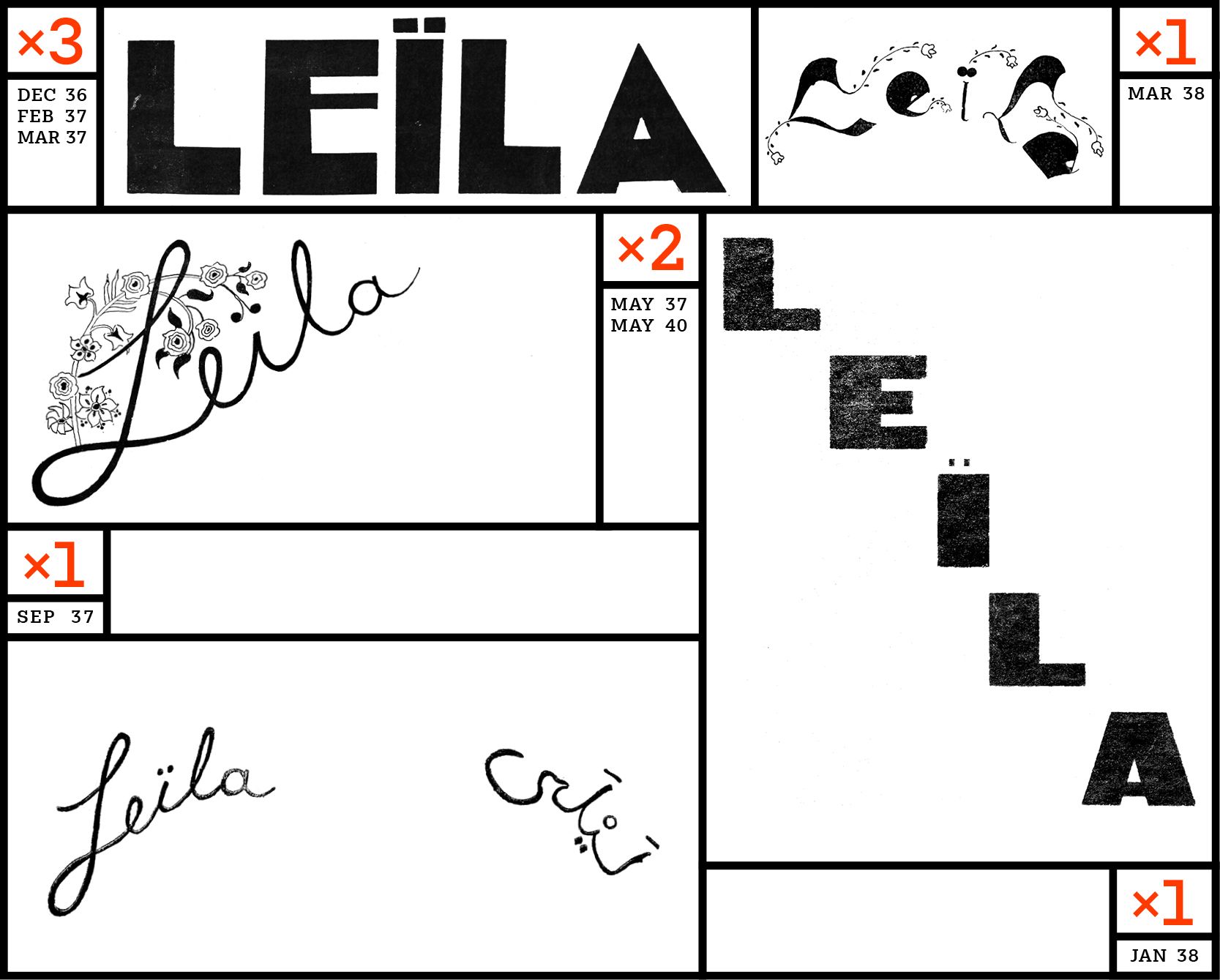
I decided to dive deeper, and find out more. Looking at the twenty issues from the first series, I found that from December 1936 to March 1938, all seven headers consistently wrote “Leïla” with a dieresis, including one bilingual header in September 1937.
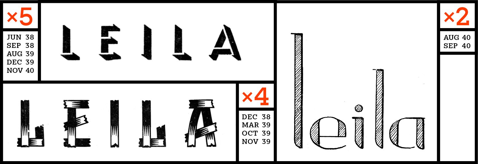
From June 1938 to November 1940, with two exceptions, the header lost the dieresis on eleven issues. It seems to me that from 1936 to 1938, the header is made of lettering (letters drawn by hand), and that from 1938, the lettering header had been replaced by type. Were the typefaces in use missing diacritics?
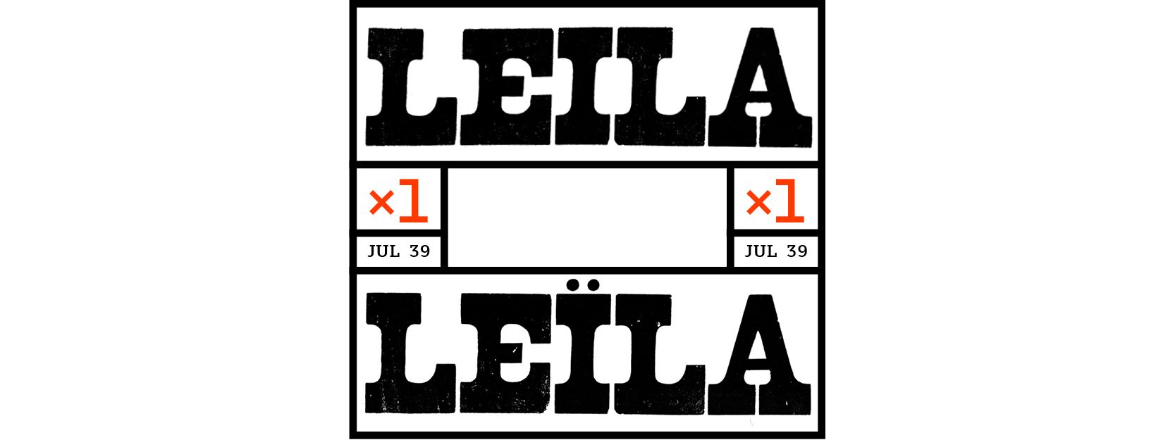
One exception remains: A double cover issue from July 1939, where the header seems to be hand lettering again. On the first cover, it reads “Leila,” whereas on the second cover it reads “Leïla,” which brings the total count to nine “Leïla” and 12 “Leila.”
In her thesis Anxiety in the Border Zone: Transgressing Boundaries in Leïla: Revue Illustrée de la Femme and in Leïla: Hebdomadaire Tunisien Indépendant, American-Tunisian literature scholar Nadia Mamelouk highlights how in addition to being the first Tunisian women periodical, Leïla contributed to creating a national consciousness and resisted French assimilation. She mentions the changing spelling of contributors’ names across issues (for example Ali and Aly), and writes: “These are more than just typographical errors... the multiple spellings in French suggest a resistance to the imposition of the dominant language of the colonizer.”
Rather than a typo or a forgotten and missing character, what if spelling conventions were subverted as meta resistance to colonialism, starting on the front page of the magazine?
Naïma Ben Ayed is a Provence born, Paris graduate (France), London (UK) based, type and graphic designer. After working for/with different studios for about 10 years, she recently set up her independent practice as Naïma Ben Ayed Bureau where Latin and Arabic type design and visual communication sit at the same desk. Her approach to design is telling stories with letters. She regularly leads type design and digital lettering workshops and is particularly interested in opening up the discipline to novice audiences.
Illustrations by Naïma Ben Ayed.
This text was produced as part of the L.i.P. workshop, and has previously been published in the Feminist Findings zine.


